
Red Roses in a Copper Vase

Roses in a Glass Vase

Yellow Roses in a Copper Vase

Pink Roses in a White Vase
This is how the four small paintings put together look.
You can view all my roses paintings here.
Happy viewing!
painting of realism genre by Navdeep Kular
Red Roses in a Copper Vase
Roses in a Glass Vase
Yellow Roses in a Copper Vase
Pink Roses in a White Vase
This is how the four small paintings put together look.
You can view all my roses paintings here.
Happy viewing!
For a while I have thinking about painting cherries. Following are some of the compositions with cherries that I have painted. Some of the cherries have toppled over the bowls and create movement in the paintings.
Cherries in a Glass Bowl
For the darkest cherries, I used crimson, vermillion and a bit of ultramarine blue. For the brightest parts vermillion was mixed with cadmium yellow and white. For highlights white and lemon yellow were added to the reds.
Cherries in a Blue Bowl
The blue bowl was painted using cobalt blue and later on the flowers were added.
Cherries in a Bone China Bowl
The white bowl was painted by adding lemon yellow to white for the lighted part and bit of crimson and ultramarine to titanium white for the shaded parts.
Cherries on a Plate
The shaded parts in and around the plate give it its shape. This is how the four paintings put together look.
You can view my other still life paintings here.
Happy viewing!
My fascination with colours and shapes have prompted me to explore different subjects. Here is my attempt to paint a teapot and grapes.
Still Life with Teapot and Grapes 1
And a sequel to this painting.
Still Life with Teapot and Grapes 2
This is how the two paintings put together look.
You can view my other still life paintings here.
Happy Viewing!
Painting from life shows up so many colours and brings new insights in the work which are usually missing in paintings from photographs. I have tried my hand at the following lemon paintings.
The lemons have been painted using lemon, cadmium and ochre yellow. Looking down on the lemons placed in a plate with sunlight casting bright shadows of lemons and plate, I tried figuring out the colours.
Next, I placed the lemons in a glass bowl. This is my first painting of a glass bowl. In retrospect, I think I should have placed more emphasis on drawing a proper ellipse of the rim before painting. At some places the colour of the glass bowl seemed closer to sap green, at other places it seemed to have a bluish and greyish tinge. One lemon appeared to be more greener, other one had more darker colour due to shadows falling on it.
Lemon Tea is the next painting in this sequence of lemon paintings. This has another first, my first teacup and saucer painting. The golden base of the teacup was painted using cadmium yellow, blue, white and red.This painting is also a study of the primaries with cherries added to it.
Lemon and a Creamer gave me the opportunity to observe the colours in a white creamer. How the yellows, blues and reds in small quantities added to the white make the shape of rounded objects evident. The handle of the creamer was casting a shadow on it. The painted flowers on the creamer were lightened by the sunlight.
Happy Viewing!
The Dhauladhars
The Dhauladhar is a Himalayan mountain range which can be viewed from the province of Himachal Pradesh is India. “Dhaula” literally means white in Hindi. That is the reason why this range of snow clad mountains has been named Dhauladhar.
With this painting of Dhauladhars, I have tried my hand at landscape painting after decades. To be precise, my previous landscapes have actually been seascapes. So, this is the first green landscape to be painted after a foray into flower paintings.
The Dhauladhars with snow clad mountain range and its reflection in the lake is an original oil painting. My style is changing from realism to impressionism and I am discovering new colours on my palette. I enjoyed painting the lighted side of mountains with little lemon yellow mixed in titanium white. I also enjoyed mixing bits of greys, blues and violet in white to depict the shadow side of snow clad peaks. The winding mountain path disappearing into the forest takes the gaze towards the forest.
Hope you enjoy this sneak peek into the majestic Himalayas!
Himalayan Landscape
Himalayas are home to some of the highest and most picturesque mountain peaks in the world. These mighty mountains have been the source of inspiration for many writers, artists, mountaineers, and leaders from around the world. Himalayas have been the abode of many saints and rishis. The beauty and serenity of its mountain ranges is unmatched in the world. The altitude of Himalayas tests the endurance of human beings.
Himalayan landscape is an original oil painting depicting the serene snow clad peaks of the majestic Himalayas. The water gushing down these mighty peaks creates a music of its own. The water picks up the colour of mountains, rocks, foliage, sky and sand as it makes its way forward. The sunlight plays hide and seek on the grasslands and sandy patches next to the water. I particularly liked depiction of melting ice and variety of earthy tones in this painting.
Happy viewing!
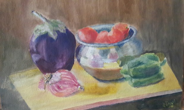
Still Life painting with artist’s reflection in a metallic bowl
Painting from life is a thrilling experience. This is the first time I have painted a metallic bowl and you can see my reflection in it.
I keep admiring things all around all the time whether travelling or at home. The petals of flowers, colours of foliage, flowers on the trees, light and dark patches of green fields, mountain ranges, sunlit snow capped peaks and so on. The inspiration for this painting came from an unusual source.
As I was looking around the house for inspiration, I felt like painting a bowl. Painting a bowl is close to my flower vases. But which bowl to paint; a bone china one, a crystal one or a glass one? I thought that nothing would reflect better than a metallic one. I have placed fruits with flowers in couple of previous still life paintings but never painted vegetables ever. This was an experiment that I was conducting for the first time. I put together colourful vegetables available at that moment and placed everything on a yellow cutting board on my painting table. I filled up the bowl with tomatoes. Juggled around a bit to place capsicum, onion and brinjal around the bowl. Finally I was happy with my composition and started painting.
The arrangement was placed next to my palette. I was looking down on the arrangement from right hand side. Light was shining on the objects from the window on the left. There were so many reflections in the metallic bowl. I noticed so many colours in ordinary onion. It’s outer peel towards the left added another dimension to the composition. The copper bottomed bowl shows the reflections of three vegetable pieces placed around it. It also shows the reflection of yellow cutting board. I am also there. I had not thought about it before the start of the painting process, otherwise another colour could have been added to the composition with the change of dress. This being my first attempt at painting metallic bowl, I kept looking at it again and again to determine whether the colour was white, cream, dark blue, brown, black or dark green in various parts. The rim has so many colours.
This is an alla prima painting. I forgot to take the pictures before the start of painting. I took a few after I finished painting but none reflects the angle from which I was looking. I am happy with the end result. I am amazed that beauty can be found in such mundane things. The only concern is ‘How will it look on my Facebook page (Paintings by Navdeep Kular) and Instagram feed(@navdeepkular_oilpaintings) with all the floral paintings? Should I even post it there?’ What do you say? As of now, this unique painting catches attention while drying with floral paintings all around it.
Happy browsing!
Celebratory Peonies
After painting many small peony paintings, I was still not done with the peonies. As a result Celebratory Peonies came into being. I have put together peonies of many colours and sizes in this painting. The flowers and buds have been placed at varying angles. I love flowers popping out against a dark background in this painting. I have added many buds; closed and semi open in this painting along with the flowers which serve as eye magnets.
Oil on Canvas
18H x 24W
Peonies oil painting by Navdeep Kular
Happy viewing!
Path to Eternity
Oil on Canvas
11H x 14W
Cherry orchard in blossom oil painting by Navdeep Kular
Spring time rejuvenates the mind, body and soul. It breathes life into nature all around us. It is symbolic of newness and fresh beginnings. The freshness and fragrance of spring is hard to miss.
Path to eternity is an ode to melodies of spring through the medium of oil painting. It is an original oil painting with compelling composition of a path in a cherry blossom orchard. The newly sprouted flowers on the cherry trees add colour and life in the painting. The grass in the light and shade contrast the pink and white flowers. The arched pathway adorned with fallen petals which prompts the viewer to look through it towards the horizon is the highlight of the painting.
Happy viewing!
Pink Peonies
There are still more peony paintings on the way. A card given by a dear cousin served as reference picture for this peony painting. The dark leaves and colour of the vase provide ample contrast to the peonies. Another highlight of the painting is the yellow colour shining through pink petals.
Happy browsing!
Springtime gives an opportunity to paint different flowers. Mother earth is decorated with flowers of various colours, textures and sheens. I have been busy soaking in as much beauty of nature as possible. Spent the time admiring flowers and foliage. The different shapes and colours of leaves too intrigue me. The flowering trees add their own persona to the landscape. Tried to capture as many pictures as possible. Many memories of beautiful landscapes are embedded deep in the mind. They periodically come out in the form of paintings. I wanted to paint a blue jug and thought daffodils would go well with it. So here is the end result.
Serenity
Placed the composition by the window side on a wooden cabinet. Mixed ultramarine blue with crimson lake to paint the shadow side of the jug. For the base added a little bit of cobalt blue. With highlights and shine on the jug was able to define its roundness. Experimented with a few colours for the wooden cabinet and ultimately settled with the present one. Painted the lacy mat underneath the jug. The dark background compliments the light flowers.
Named this painting Serenity. Hope you like it.
Painting is a skill in which finesse comes only through practice and hard work. It is an intrinsic knowledge which gets embedded deep inside as one progresses on the learning curve. Elementary knowledge can be gained through secondary sources regarding the tools and techniques of oil painting but the learning comes only by doing it. What colours to use, what amount to mix, which medium to add, how to apply colours, which brushes to use, impact and direction of brushstrokes; one gets better and better at it through each painting.
As I was painting flowers in a vase, I realised how much I enjoyed painting the vase. The idea to paint more than one vase in a single painting occurred at that point of time. That is how the following two paintings came into being.
Peonies and the Blues 1
I wanted to mix the blues and experiment with different shapes of the vases. These paintings gave me ample opportunity to do so. Cobalt, ultramarine, Prussian blue were mixed with viridian hue, lemon yellow and titanium white for various vases. It was fun to paint the highlights on the vases. Once the vases were painted, I felt like painting some flowers in them. So added the peonies in one of the vases in each painting.
Peonies and the Blues 2
The colour of the background is in contrast to those of the vases. The table and the background were painted using the same three colours i.e. crimson lake, ultramarine blue and cadmium yellow. How the ratio of the colours in the mix can yield a vastly different end result is apparent from this study.
This is how the two paintings put together side by side look.
Happy Browsing!
White Roses in a Vase (11H X 14W)
Original still life painting of White Roses in a Vase by Navdeep Kular
Oil on canvas
11H X 14W
This painting is a sequel to Still Life with Red Roses. Along with the roses, the bowl of fruit is a common element between the two paintings. White roses have been painted in an impressionist manner.
Peonies in a Turquoise Vase
Oil on Canvas (14H X 11W)
Peonies with their multiple petals are fun to paint. Painting one turquoise vase was not enough for me, so I painted these peonies in one.
Peonies in a Turquoise Vase is an original oil painting. Peonies have been placed in such a manner that each flower is tilted at a different angle. Dark wood table contrasts the light background.
The mixing of crimson lake, ultramarine blue and cadmium yellow leads to many colours and I keep experimenting with them. The different wood colours ranging from yellowish to fawn to light brown to blackish brown, can all be obtained by the use of primary colours. Also painting the shadows is as much fun as painting the highlights. The variation of values in the shadows leads to three dimensional effect. The negative painting sharpens the edges.
Happy Browsing!
Red Roses in a Turquoise Vase
Another painting of red roses. Red roses in a turquoise vase is an original oil painting. The central focal point of this painting is the highlight on turquoise vase on the right. I like the gloss on the vase in this painting. I tried to achieve asymmetrical balance in this composition by placing a big vase on the right and balancing it with a bowl of fruits on the left. The colours red and orange are close to each other on the colour wheel, still I have experimented with placing them together.
Enjoyed painting the folds of white curtain in the background. I painted the window with adding whites, greys and little bit of brown to warm it up. I rarely use paint directly from the tube. It is too much fun mixing the basic colours and generating innumerable hues with them. The iris flowers in the wall hangings have been painted with blurred edges. The background colour was mixed using viridian hue with lemon yellow and lit bit of titanium white.
Happy Browsing!