
Red Roses in a Copper Vase

Roses in a Glass Vase

Yellow Roses in a Copper Vase

Pink Roses in a White Vase
This is how the four small paintings put together look.
You can view all my roses paintings here.
Happy viewing!
flowers in a vase oil painting by Navdeep Kular.
Red Roses in a Copper Vase
Roses in a Glass Vase
Yellow Roses in a Copper Vase
Pink Roses in a White Vase
This is how the four small paintings put together look.
You can view all my roses paintings here.
Happy viewing!
Pink Peonies
There are still more peony paintings on the way. A card given by a dear cousin served as reference picture for this peony painting. The dark leaves and colour of the vase provide ample contrast to the peonies. Another highlight of the painting is the yellow colour shining through pink petals.
Happy browsing!
Roses, tulips and daffodils have been painted in a glass vase. The two images above show how an oil painting can be transformed. More depth has been added in the painting using various tones, tints, values and hues to depict the lit and shadow areas of flowers.
The shape of some flowers has been varied to incorporate the three dimensional effect. Two of the poppies in the original painting have been transformed into tulips. The foliage has been redone. The whites of the daisies have many more colours now.
The vase has been placed on a table. The transparent glass vase and the dark wood table provide a contrast in the painting. The background colour has been changed. The colour of the table and the background is visible through the glass vase. All this has resulted in a vibrant painting.
Happy browsing!
White Roses in a Vase (11H X 14W)
Original still life painting of White Roses in a Vase by Navdeep Kular
Oil on canvas
11H X 14W
This painting is a sequel to Still Life with Red Roses. Along with the roses, the bowl of fruit is a common element between the two paintings. White roses have been painted in an impressionist manner.
Peonies in a Turquoise Vase
Oil on Canvas (14H X 11W)
Peonies with their multiple petals are fun to paint. Painting one turquoise vase was not enough for me, so I painted these peonies in one.
Peonies in a Turquoise Vase is an original oil painting. Peonies have been placed in such a manner that each flower is tilted at a different angle. Dark wood table contrasts the light background.
The mixing of crimson lake, ultramarine blue and cadmium yellow leads to many colours and I keep experimenting with them. The different wood colours ranging from yellowish to fawn to light brown to blackish brown, can all be obtained by the use of primary colours. Also painting the shadows is as much fun as painting the highlights. The variation of values in the shadows leads to three dimensional effect. The negative painting sharpens the edges.
Happy Browsing!
Red Roses in a Turquoise Vase
Another painting of red roses. Red roses in a turquoise vase is an original oil painting. The central focal point of this painting is the highlight on turquoise vase on the right. I like the gloss on the vase in this painting. I tried to achieve asymmetrical balance in this composition by placing a big vase on the right and balancing it with a bowl of fruits on the left. The colours red and orange are close to each other on the colour wheel, still I have experimented with placing them together.
Enjoyed painting the folds of white curtain in the background. I painted the window with adding whites, greys and little bit of brown to warm it up. I rarely use paint directly from the tube. It is too much fun mixing the basic colours and generating innumerable hues with them. The iris flowers in the wall hangings have been painted with blurred edges. The background colour was mixed using viridian hue with lemon yellow and lit bit of titanium white.
Happy Browsing!
Peach Roses in a Vase
Peach Roses in a Blue Vase is an original oil painting. Creative work is a source of immense joy and satisfaction.
The sharp front edge and softened rear edge of the wooden table provide depth to the painting. The shapes and colours visible on the vase intrigued me while painting. The reds, yellows and whites were used with blues for painting the vase. The colour palette started from titanium white and lemon yellow on one hand to crimson lake, ultramarine blue, cobalt blue and ivory black on the other side. The backdrop of this painting is unique. The flowers seem to be in symphony with the background.
Happy browsing!
Sunflowers in a Blue Vase
Sunflowers in a Blue Vase is an original oil painting. The bright, cheerful disposition of sunflowers brings sunshine in our lives.
I have experimented with mixes of cobalt blue, ultramarine blue, viridian hue, crimson lake and titanium white in this painting. All the yellows; lemon, ochre, chrome and cadmium along with tinges of reds and whites have been used for the flowers.
I hope viewing this painting brings sunshine in your life!
Red Flowers in a Vase
Red flowers in a vase is an original oil painting. The mirror on the wall shows the reflection of the flowers.
Red flowers are multi layered with some facing the front, others sideways, some hanging down and a few upright. The view outside has been painted in cool colours. Trees are visible at a distance. The folds in yellow curtain have been accentuated with the use of dark colours.
The oval edge of the table is visible through the lace table cloth. The light from the window shines on the intricate lace tablecloth. The dark flooring is complementary to the white drape of the table. White flowers bloom in the potted plants.
Happy browsing!
After painting roses for days together, I was looking for a different flower to paint. I came across a painting by Henri Fantin-Latour of chrysanthemums in yellow colour. I instantly liked the bright yellow flowers and the composition of the painting. I felt like painting bright yellow chrysanthemums after pale roses for weeks. That is how the decision to paint chrysanthemums was made.
Chrysanthemums in a Ceramic Vase
This is how the painting has turned out. The layers of petals of the flowers took time to paint. Various mixes of cadmium, lemon and ochre yellow with tinges of reds, blues and whites were used to get the various values, hues, tints, tones and shades of flowers. The more I painted, the more I appreciated the great artist’s brushstrokes and nuances in the rendition. I changed the background from the original and added more texture to it. Also the blue painting on the ceramic vase is different.
Happy viewing!
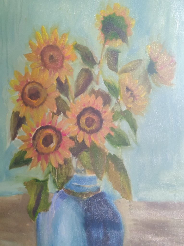
The Rosy Wealth of June is Henri Fantin-Latour’s painting that adorns the wall of National Gallery in London. In this painting the artist has painted late summer blooms. The painting’s title was probably chosen to appeal to English patrons who outnumbered the ones in his own country during his lifetime. The sharpness in floral and still life paintings of Fantin matches that of Dutch and Flemish old masters.
The Rosy Wealth of June
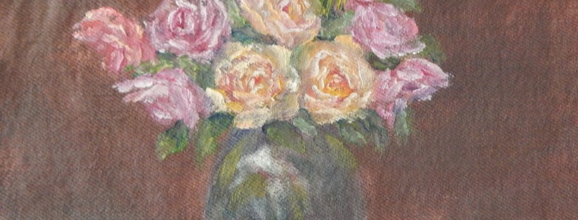
Here is my ode to the great master. The crystal vase, the bunch of flowers and leaves, all presented a challenge to amateur artist like me. One by one, I started tackling the issues. The flowers required highlights day after day as the layers of oil paint dried. The vase had to depict the shadows and light at various places along with stems of the flowers it holds.
The dark green foliage gives depth to the painting. Many mixes of blues and yellows were used to create various shade of green. Both cadmium and lemon yellow were used along with a tinge of blue and lots of white in yellow roses. The red ones have crimson lake with blue for the darkest tone, then a mix of cadmium red and crimson lake followed by little yellow and white with red for the highlights.
Happy viewing!
Pink Roses in a Turquoise Vase
For a while I had been thinking about painting flowers in a turquoise vase. I had painted red, blue, green and glass vases in the past but never a turquoise vase. The colour evokes mystery and is appreciated only by discerning viewers. Others just categorise it as a general blue colour. In a painting, light changes the basic colour and makes the vase more interesting.
Which flowers to paint? Roses were uppermost in my mind. Next, the decision was to be made about the colour of the flowers. The white flowers would go best with the turquoise vase. For a moment, I visualised white lilies in a vase. Then thought about white roses with various hues of yellows and pinks in the petals. But white flowers would shine only on a dark background and I was not in a mood to paint dark background. Most of the roses I had recently painted were in tones of vermillion hue. So thought of using crimson lake with its varying hues, values and tints. The buds which I painted in the end fascinated me the most. Each one is placed at a different angle and is of different size. They serve as eye magnets to bring the attention to the central rose flower. Enjoyed the challenge of painting a sheer table cloth with few petals scattered around.