I have painted Irises after a gap of few years. All my previous iris paintings have flowers of single colour. The ones now are bouquet of Irises of different colours. One bouquet has been painted with a flower pot and another without one. One has a dark background while the other has a light one. Which one do you think looks better?
Ever since I saw this painting in the National Gallery, London, I have been wanting to paint it. It is my tribute to the great artist Henri Fantin-Latour whose flower paintings are a treat to watch.
A Basket of Roses
There have been Dutch and Flemish old masters whose floral paintings too, adorn museums around the world. Van Huysum, Heade and Jan Bruguel are some of the famous old masters who created realistic paintings of flowers and were patronised by the high and mighty of their times. The vases with flowers of various seasons combined together on mostly marble table tops are the highlight of their paintings.
My personal liking is for Fantin’s paintings. The compositions, lighting and realism are all eye catching.
A Basket of Roses has pink, red, yellow, white and peach roses, all put together in a basket in an attractive manner. The roses toppled over on the table create a flow in the painting. While painting, I realised how many leaves were there along with the roses.
There are still more peony paintings on the way. A card given by a dear cousin served as reference picture for this peony painting. The dark leaves and colour of the vase provide ample contrast to the peonies. Another highlight of the painting is the yellow colour shining through pink petals.
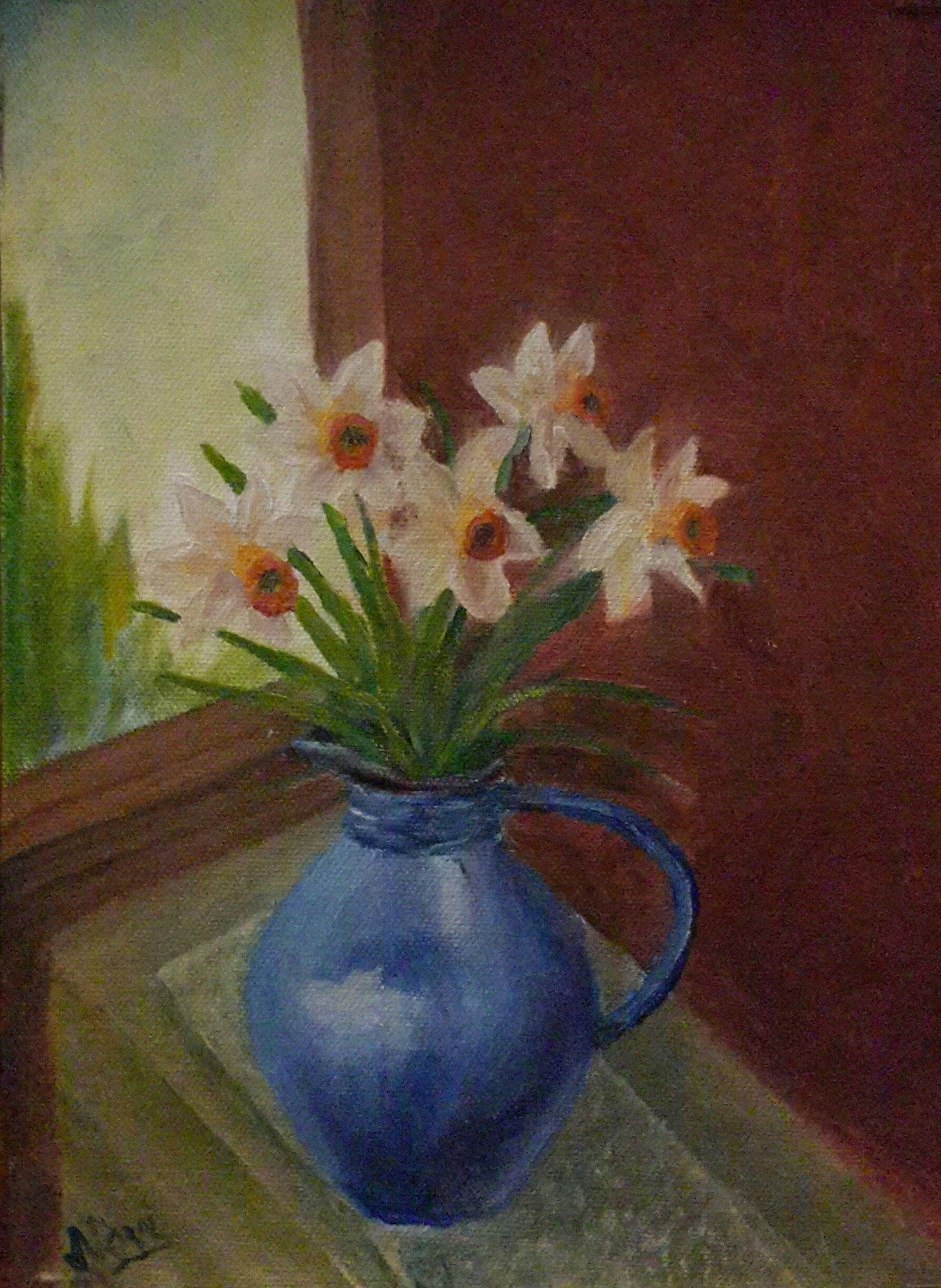
Springtime gives an opportunity to paint different flowers. Mother earth is decorated with flowers of various colours, textures and sheens. I have been busy soaking in as much beauty of nature as possible. Spent the time admiring flowers and foliage. The different shapes and colours of leaves too intrigue me. The flowering trees add their own persona to the landscape. Tried to capture as many pictures as possible. Many memories of beautiful landscapes are embedded deep in the mind. They periodically come out in the form of paintings. I wanted to paint a blue jug and thought daffodils would go well with it. So here is the end result.
Serenity
Placed the composition by the window side on a wooden cabinet. Mixed ultramarine blue with crimson lake to paint the shadow side of the jug. For the base added a little bit of cobalt blue. With highlights and shine on the jug was able to define its roundness. Experimented with a few colours for the wooden cabinet and ultimately settled with the present one. Painted the lacy mat underneath the jug. The dark background compliments the light flowers.
The beauty of peonies prompts me to paint these flowers again and again. A card given by a dear cousin was an inspiration for this painting. The challenge was to make the peonies stand out on a light background. In the end, I was able to illustrate the volume of numerous petals of peonies. I like the fluffiness of peonies, the roundness of vase and the sharp front edge of table in this painting. The shadows of the leaves lift them in the air. The cool colour palette of the foreground and middle ground has been contrasted with a tinge of yellow in the background.
Roses, tulips and daffodils have been painted in a glass vase. The two images above show how an oil painting can be transformed. More depth has been added in the painting using various tones, tints, values and hues to depict the lit and shadow areas of flowers.
The shape of some flowers has been varied to incorporate the three dimensional effect. Two of the poppies in the original painting have been transformed into tulips. The foliage has been redone. The whites of the daisies have many more colours now.
The vase has been placed on a table. The transparent glass vase and the dark wood table provide a contrast in the painting. The background colour has been changed. The colour of the table and the background is visible through the glass vase. All this has resulted in a vibrant painting.
Original still life painting of White Roses in a Vase by Navdeep Kular
Oil on canvas
11H X 14W
This painting is a sequel to Still Life with Red Roses. Along with the roses, the bowl of fruit is a common element between the two paintings. White roses have been painted in an impressionist manner.
Peonies with their multiple petals are fun to paint. Painting one turquoise vase was not enough for me, so I painted these peonies in one.
Peonies in a Turquoise Vase is an original oil painting. Peonies have been placed in such a manner that each flower is tilted at a different angle. Dark wood table contrasts the light background.
The mixing of crimson lake, ultramarine blue and cadmium yellow leads to many colours and I keep experimenting with them. The different wood colours ranging from yellowish to fawn to light brown to blackish brown, can all be obtained by the use of primary colours. Also painting the shadows is as much fun as painting the highlights. The variation of values in the shadows leads to three dimensional effect. The negative painting sharpens the edges.
Another painting of red roses. Red roses in a turquoise vase is an original oil painting. The central focal point of this painting is the highlight on turquoise vase on the right. I like the gloss on the vase in this painting. I tried to achieve asymmetrical balance in this composition by placing a big vase on the right and balancing it with a bowl of fruits on the left. The colours red and orange are close to each other on the colour wheel, still I have experimented with placing them together.
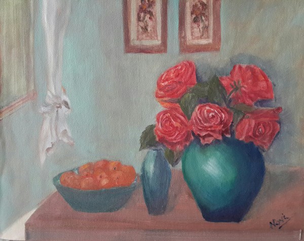
Enjoyed painting the folds of white curtain in the background. I painted the window with adding whites, greys and little bit of brown to warm it up. I rarely use paint directly from the tube. It is too much fun mixing the basic colours and generating innumerable hues with them. The iris flowers in the wall hangings have been painted with blurred edges. The background colour was mixed using viridian hue with lemon yellow and lit bit of titanium white.
Flowers from special occasion always prompt me to record them in the form of an oil painting. These flowers are from a grand reception party. The bouquets were heavenly with rose buds and pink peonies arranged in a pleasing manner. I kept on admiring the flowers the entire evening. While the guests were saying their goodbyes, I was going around the tables and clicking as many angles as possible of elegant bouquets placed as centrepieces.
After months, I sat down to paint the reception bouquet. The painting is not exact replica of that flower arrangement. In the reception bouquet, the vases were barely visible on the tables as the foliage was almost touching the table. As I have been painting vases in the recent past, in my eagerness to paint the vase, I have lifted the bouquet up a bit.
This painting has turned out to be a bright one with the darkest darks placed against the lightest lights.
It is always fun to experiment with colours. After painting red, pink, white and peach roses, here is an attempt to paint yellow roses.
Various yellows such as ochre, chrome, cadmium and lemon have been used with mixes of reds, blues and whites to paint the roses. The supporting flowers compliment the yellow roses. The light shining on the crystal vase shows its edges.
The burnt umber background makes the flowers glow. The direction of the brushstrokes make evident the fall of the table cloth at the edge of the table. Few flowers have been placed on the table to balance out the top heavy composition.
Pink Roses in a Crystal Vase is an original oil painting. The magic of RYB has helped me mix numerous colours which have been used in this painting.
The crystal vase is placed on a wooden oval table. The edges of the table and those of the window sill and the boundary wall provide depth to the painting. Grey clouds are visible in the sky outside. The dark curtain provides a backdrop to the flower arrangement. The light and shadows on the vase along with the stems of the flowers give vase its shape and character.
Peach Roses in a Blue Vase is an original oil painting. Creative work is a source of immense joy and satisfaction.
The sharp front edge and softened rear edge of the wooden table provide depth to the painting. The shapes and colours visible on the vase intrigued me while painting. The reds, yellows and whites were used with blues for painting the vase. The colour palette started from titanium white and lemon yellow on one hand to crimson lake, ultramarine blue, cobalt blue and ivory black on the other side. The backdrop of this painting is unique. The flowers seem to be in symphony with the background.
Pink Roses in a Vase is an original oil painting. Pink roses are arranged in a circular formation in a round vase.
It was fun painting a light wooden table top. The sharp front edge and the softened rear edge flatten the table. The shape and colour of the vase is different from my previous paintings. The impact of light shining on the vase is depicted through bold brushstrokes. Pink roses illuminate against a textured dark backdrop. I am amazed at the number of colours one can generate with the use of primary colours.
Tulips in a Crystal Vase is an original oil painting. A triangular crystal vase has been painted in this composition, although only one face is visible. As the crystal objects have numerous edges, these shine with different intensity as the light falls on them. An attempt has been made to capture this property of the material. The window shows view outside and creates depth in the painting. Tulips merrily swing to the sides. The green foliage provides a contrast to the flowers. The same is the effect of crystal vase on a dark table top.


")